
Your item detail modal is where the final purchase decision happens. Optimizing this interface with visual psychology, clear modifier structures, and micro-interactions can increase average basket sizes by 15% or more.
An exploration of menu design psychology, image placements, customization layouts, and staggered animations inside high-converting item detail modals.
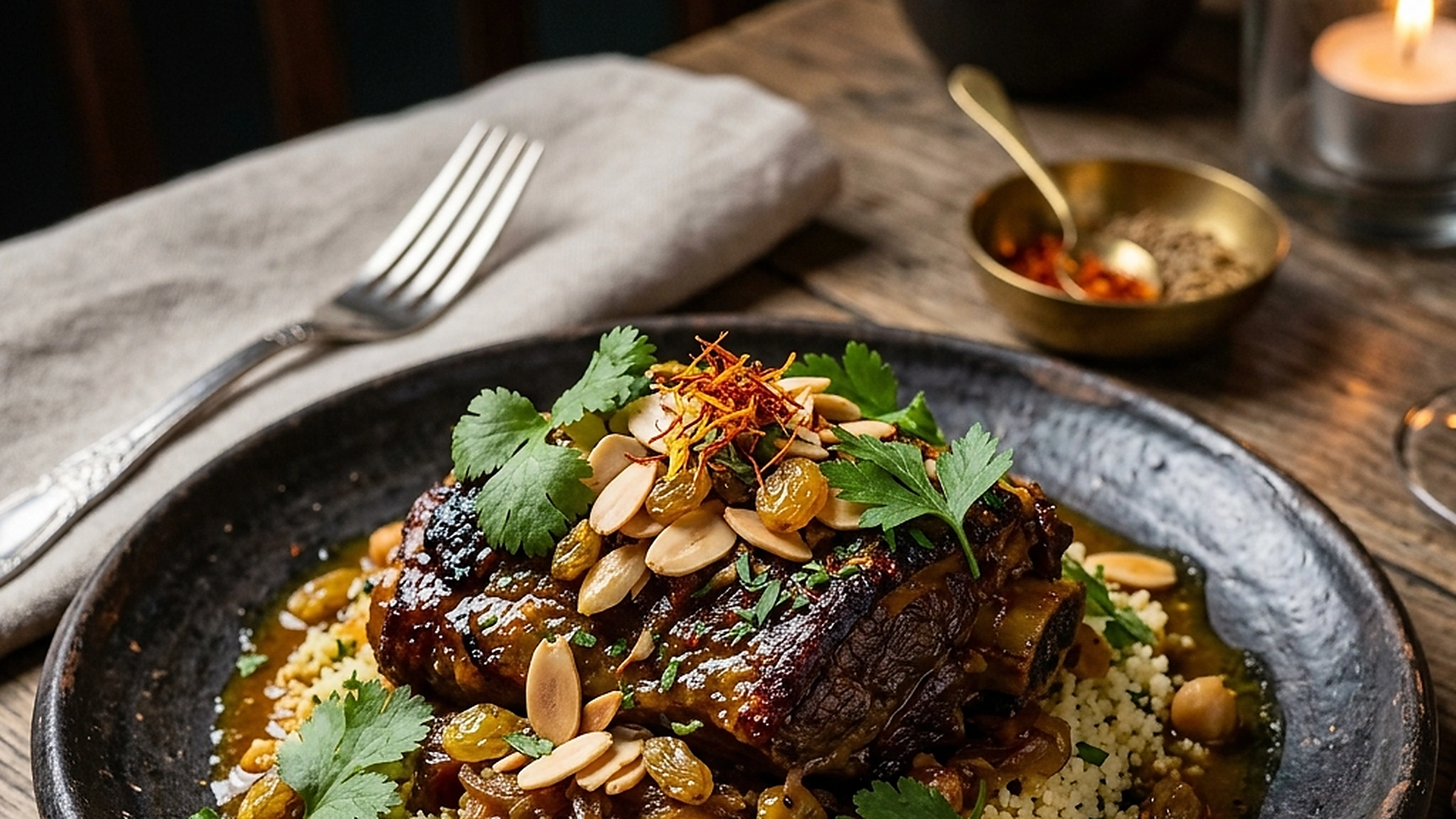
- Use high-fidelity food photography that highlights texture, scale, and serving presentation.
- Organize customization options into clear, radio/checkbox groups with price tags.
- Implement smooth, hardware-accelerated transition animations for item openings.
- Keep the CTA button sticky at the bottom of the screen on mobile devices.
1. The Visual Psychology of Premium Food Presentation
A simple text description can tell a guest what ingredients are in a dish, but it does not make them hungry. High-fidelity visual assets are the single most powerful driver of food orders. When a guest opens an item detail view, the photo must be the hero of the screen.
Use professional food photography that captures the steam, color, and texture of the dish. Avoid stock photography, as guests feel disappointed if the actual food served does not match the image. A beautiful, honest presentation creates anticipation and makes premium pricing feel justified.
2. Structuring Modifiers and Upsell Add-ons Without Overwhelm
Customizing a dish (e.g., adding extra toppings, choosing a side, or selecting cooking temperature) is a key revenue driver. However, presenting too many options at once can create decision fatigue, causing the guest to skip customizations or exit the modal.
Group modifiers logically into collapsible sections or step-by-step choices. Clearly indicate which choices are required (e.g., "Choose your side") and which are optional (e.g., "Add extras"). Display price increases next to each option so the guest understands the cost transparently.
3. The Role of Smooth Transitions and Micro-Animations
In mobile web design, the transition between the menu grid and the item detail view determines how premium the app feels. A sudden jump or screen flash looks unpolished. Smooth, staggered animations create a sense of tactile interaction.
Use hardware-accelerated CSS transitions to slide or expand the modal from the tapped card. Animate elements like the close button, photo scale, and add-to-cart button in sequence. This micro-movement delights the user and makes browsing feel satisfying.
4. Optimizing the Add-to-Cart CTA on Small Mobile Screens
On mobile devices, the guest is browsing with their thumb, often while holding a drink or conversing at the table. The primary call-to-action (CTA)—the "Add to Cart" button—must be immediately accessible and easy to tap.
Position the CTA in a sticky bar at the bottom of the screen, ensuring it remains visible even when the guest scrolls through long description text or modifier lists. Use a high-contrast background color and display the total price dynamically on the button itself.
5. Architectural Reliability and System Uptime
Maintaining high availability is fundamental for hospitality applications operating in real time. Redundant server infrastructure and edge replication ensure your digital menu stays active during high-volume dinner rushes without service dropouts.
6. Data Privacy, Encryption, and Security Controls
Protecting customer privacy and venue data is a core operational priority. End-to-end encryption, strict role-based permissions, and cookieless browsing standards safeguard your venue's analytics and guest interactions.
7. Measuring Long-Term Operational Impact
Evaluating long-term metrics enables continuous menu refinement. By tracking guest conversion rates, popular dish views, and average order values, venue managers can make data-driven improvements that boost revenue.
Frequently Asked Questions
What is the ideal image ratio for mobile item detail views?
A 16:9 or 4:3 aspect ratio is ideal for mobile screens, placing the image at the top of the modal and allowing description text to flow naturally below.
Should we show descriptions for every ingredient, or keep it short?
Keep the main description short and punchy, focusing on flavor and texture. You can offer a collapsible "Ingredients" section for guests who want to read more.
How many modifiers should we offer before it hurts conversion?
Limit active choices to 3-4 groups per item. If you need to offer more, use multi-step forms to prevent guest confusion.
Final Takeaway
The item detail modal is your digital sales pitch. By combining stunning visuals with clean customizations and mobile-first logic, you make ordering easy, enjoyable, and highly profitable.